The Command Interface
I figured a progress update every 3 days would be a fair update interval, giving me an excuse to slack off for a day (which thanks to some determination hasn’t been necessary yet) as well as give some headway in case I get stuck on a module that I plan to discuss, which shouldn’t happen for a bit as I should have enough content for two weeks already, assuming I don’t go off and make a huge post for some reason.
Either way, I figured the next topic I’d mention is the command interface – the bar somewhere on the screen that gives you pretty much half the control of an RTS game, probably a bit more so in a strategy game. There isn’t a huge choice where to put the interface, there’s basically three options.[
](https://renscreations.com/wp-content/uploads/2013/10/minimap2.jpg)
- Put the bar on the left or right side of the screen, turning the play area into what’s more of a square but allowing a more equal area of visibility.
- Put the bar on the bottom (or the top?) of the screen, turning the play area into a more wide field of view, but depending on the camera angle this can limit visibility depending on the size of the interface. (Notice the “depending on” going on)
- Use a minimal interface which some of the newer C&C games have done, having essentially a transparent panel
While I’ve played a variety of RTS games including the C&C series, Age of Empires series, Company of Heroes, Men of War (more on that later), and a few more (trying to keep the list short!), my main influence are the old C&C games so I figured I’d put the bar on the right side of the screen.
[
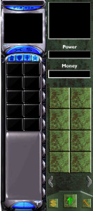
](https://renscreations.com/wp-content/uploads/2013/10/panels.jpg) In the image below, the left is the Red Alert 2 ‘Allied’ command interface, the right is my current version. There’s a few design changes here which haven’t really been finalized. The style is very bland but it allows me to work with the core features of the interface. There are no tabs, and the power bar on the side has been changed into a numerical display. Buttons will only display items that the selected building can produce rather than at all times. Pages can be cycled left and right to remove the restriction of a limited number of buttons being active for a building. The green arrow button at the bottom will essentially be the ‘upgrade’ menu, which at the moment I’m still deciding if it will open a secondary dialog or if it will simply show upgrades in place of buttons.
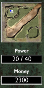
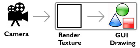
The next specific item is the minimap itself. Initially, the minimap was rendered in real-time with a constant Camera feed rendering to a Render Texture in the corner. Adding on to that, I was rendering actual 3D geometry on a hidden minimap layer directly above objects, and objects controlled their own “icons”. This would, more or less render it on the minimap. Fortunately, after being somewhat happy with the other systems I was simultaneously working on, I decided to refine the minimap. I added dedicated classes – one to handle the command interface, which would handle the minimap, which would handle icons. The minimap now contains a list of active icons which are now only loosely controlled by entities, in the sense of creating, destroying and selection. Thanks to some helper functions I added, I’ve made it a lot easier to convert a position on the world to the minimap, and vice versa. These handy helpers lead me to add clicking on the minimap to move the camera, which through the class was only a single line of code.
Icons themselves are no longer 3D geometry either, and are now properly drawn quads, with the camera direction using the OpenGL line drawing functionality. The minimap render texture is now only rendered with a camera once in the first frame of the scene after which it is destroyed and stored. There is essentially no performance loss using this method over using static imagery and it allows me to modify the terrain without having to keep track of minimap layouts.
I also wanted to go into detail a little bit about the complexity and goals of the project. I’ve made somewhat of a lazy decision not to plan and document anything with fancy UML diagrams, which has lead to some moments of confusion when developing essential systems that worked together, but it has also allowed me to head astray and work on odd little features that appeal to me on the way. The fact it’s a hobby project prevents this very decision from being a recipe for disaster, but it also makes project scope a blurred outlook. In terms of set goals, I do at least want to get base building in with units pathfinding and essentially killing enemies. Whether the enemy is going to be an AI controlled commander or a human opponent with networking isn’t really something I’m focusing on at all yet. Should I design the ‘team’ component correctly then interchanging the two scenarios may actually allow both with very little code change. However, I’ll leave this to be determined from a few more hours of late night pondering, and ultimately another post!


